Beauty Branding
The Psychology of Beauty Branding: How Color, Motion, and Typography Build Trust and Desire
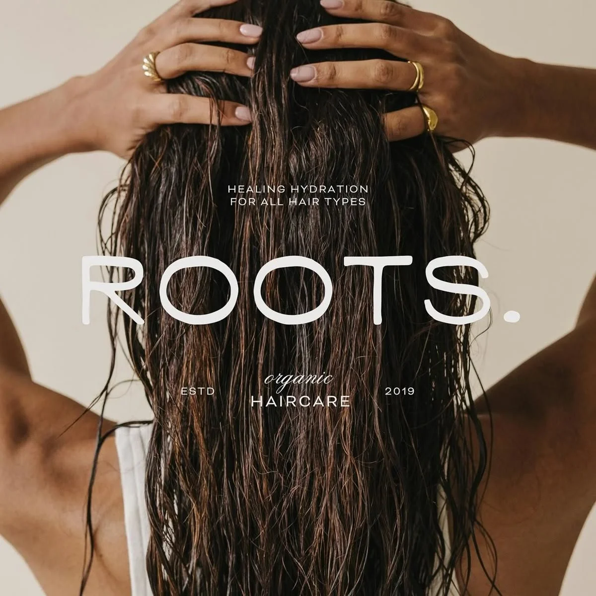
Beauty Brands Don’t Sell Products — They Sell Belief
In the beauty and skincare industry, purchasing decisions are rarely logical. Consumers aren’t just buying a serum, a lipstick, or a moisturizer — they’re buying confidence, aspiration, credibility, and self-image.
That’s why the most successful beauty brands don’t rely solely on formulation claims or influencer marketing. They invest deeply in brand psychology — the strategic use of color, motion, and typography to shape perception before a product is ever touched.
In 2026, as competition intensifies and consumers become more visually literate, beauty branding is no longer about what looks good. It’s about what feels trustworthy, desirable, and emotionally aligned. This article explores how sensory design choices influence consumer behavior — and why companies that understand this psychology build stronger, longer-lasting brands.
Why Psychology Is the Foundation of Beauty Branding
Human brains process visual information faster than words. Within milliseconds, consumers form opinions about a beauty brand’s credibility, quality, and relevance — often before reading a single ingredient.
This means brand design is doing critical psychological work:
Establishing trust
Signaling product efficacy
Communicating price positioning
Creating emotional resonance
For beauty companies, especially those operating at scale, understanding this psychological layer isn’t optional. It’s foundational.
Color Psychology: How Beauty Brands Signal Trust, Performance, and Emotion
Color is often the first brand cue a consumer registers — and one of the most powerful.
In beauty branding, color influences:
Perceived product effectiveness
Emotional tone (calming, energizing, indulgent)
Brand maturity and authority
Inclusivity and accessibility
How Leading Beauty Brands Use Color Strategically
Skincare brands focused on dermatological credibility often lean into muted neutrals, soft greens, and clinical whites to signal calm, safety, and expertise. In contrast, cosmetics brands targeting bold self-expression use saturated hues, high contrast, and confident palettes to evoke creativity and individuality.
Luxury beauty brands frequently adopt restrained color systems — not because they lack personality, but because restraint signals confidence. When color is used intentionally and sparingly, it elevates perceived value.
In 2026, many high-performing brands are also optimizing color systems for:
Dark mode experiences
Global cultural interpretation
Accessibility and legibility
Color isn’t decoration — it’s behavioral design.
Motion Design: Creating Emotion, Not Distraction
Motion has become one of the most underutilized psychological tools in beauty branding. When done well, it adds depth, tactility, and realism to digital experiences. When done poorly, it overwhelms or feels gimmicky.
Effective motion design in beauty brands:
Reinforces product texture and quality
Guides attention without forcing it
Creates a sense of refinement and care
Builds emotional continuity across touchpoints
Motion as a Trust Signal
Subtle transitions, eased animations, and responsive micro-interactions communicate precision and intentionality. They tell users that the brand is thoughtful, controlled, and premium.
For example, a skincare brand that uses slow, fluid motion to reveal product benefits subconsciously reinforces ideas of gentleness, absorption, and care. A fast, sharp motion language might work for trend-driven cosmetics, but would undermine trust in a clinical skincare line.
The most successful beauty brands in 2026 treat motion as part of their brand voice, not a layer added at the end.
Typography: The Silent Communicator of Credibility
Typography often goes unnoticed — until it’s wrong. In beauty branding, type choices quietly communicate intelligence, confidence, and legitimacy.
Typography affects:
Readability and comprehension
Perceived authority
Emotional tone
Brand memorability
Why Typography Matters More Than Ever
As beauty brands expand across platforms — websites, apps, packaging, social, email, and AR — typography becomes the glue holding the experience together.
Luxury brands tend to use elegant, editorial type systems that signal heritage and restraint. Modern beauty startups often pair clean sans-serifs with expressive accents to balance credibility with approachability.
In enterprise environments, typography systems are increasingly designed to:
Scale across global markets
Support long-form education and short-form commerce
Maintain clarity across mobile-first experiences
Strong typography doesn’t demand attention — it earns trust.
Sensory Consistency Across Digital Touchpoints
One of the biggest challenges beauty companies face is maintaining sensory consistency across channels.
A customer might:
Discover a product on social media
Research it on a mobile site
Try it virtually
Purchase via desktop
Engage with post-purchase emails
When color, motion, and typography feel disconnected across these moments, trust erodes. When they feel unified, the brand feels intentional and reliable.
The beauty brands leading in 2026 design their identities as systems, not assets — ensuring every interaction reinforces the same psychological signals.
The Emotional Impact of Clarity
Interestingly, one of the strongest psychological drivers in beauty branding isn’t excess — it’s clarity.
Clear hierarchy, readable layouts, intentional spacing, and focused storytelling reduce cognitive load. When users don’t have to work to understand a product, they feel more confident purchasing it.
This is why many high-performing beauty brands are moving away from cluttered designs and toward emotionally intelligent minimalism — where every element earns its place.
Why This Matters for Beauty Companies
For companies with ambition, passion, and a desire to build lasting brands, understanding design psychology is a competitive advantage.
It allows teams to:
Align branding with business goals
Build trust faster with new customers
Differentiate in saturated markets
Scale without losing emotional impact
Design decisions stop being subjective and start becoming strategic.
Final Thoughts: Beauty Branding Is Behavioral Design
In the beauty and skincare industry, branding is not surface-level. It’s behavioral, emotional, and deeply human.
Color shapes expectation.
Motion builds feeling.
Typography communicates credibility.
When these elements work together, they don’t just make brands look beautiful — they make them believable.
In 2026, the beauty brands that win are not the loudest or trendiest. They’re the ones that understand how design psychology turns attention into trust, and trust into desire.
And that’s where real brand power lives.