The Rise of Subtle Branding
Why restraint, clarity, and confidence are defining the most successful luxury identities today.
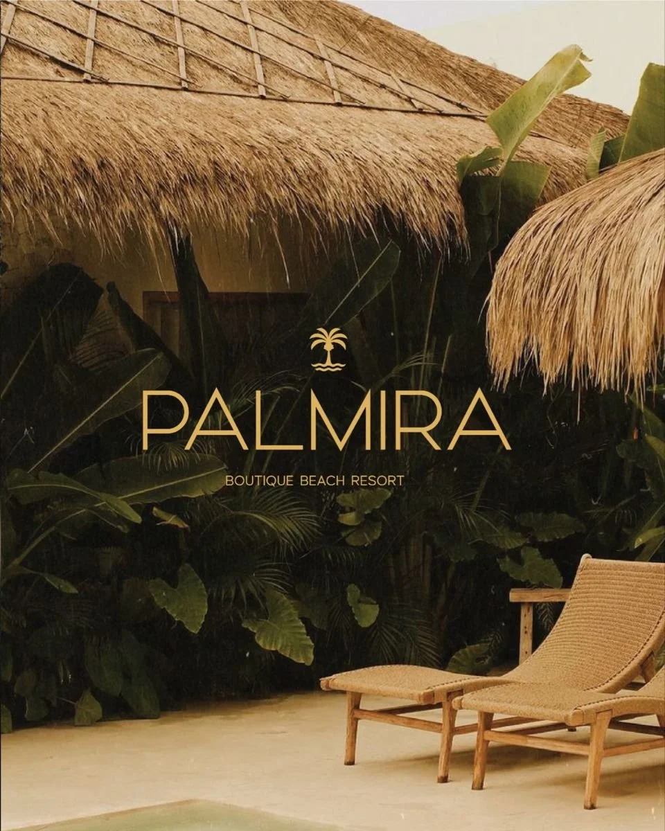
In a saturated visual landscape, the most powerful luxury brands are no longer the loudest—they are the most controlled.
2026 marks the rise of “quiet branding”, where design communicates prestige through restraint rather than excess. Logos are refined, typography is deliberate, and color palettes are carefully reduced. This isn’t minimalism for aesthetics—it’s minimalism as a signal of confidence.
Hyper-minimal logo systems now emphasize meaning over decoration. Every curve, proportion, and spacing decision is intentional, often embedding subtle symbolism into otherwise simple marks.
This approach is particularly effective in luxury real estate and hospitality, where trust and credibility are paramount. A restrained identity suggests stability, longevity, and discretion—qualities that resonate deeply with high-net-worth audiences.
Color also plays a critical role. The enduring combination of deep black and metallic gold continues to dominate, but with renewed precision. This “luxury polarity” creates maximum contrast and visual clarity, reinforcing a sense of exclusivity and control.
Ultimately, quiet luxury is not about doing less—it’s about saying more with less. It requires discipline, precision, and a deep understanding of brand positioning.